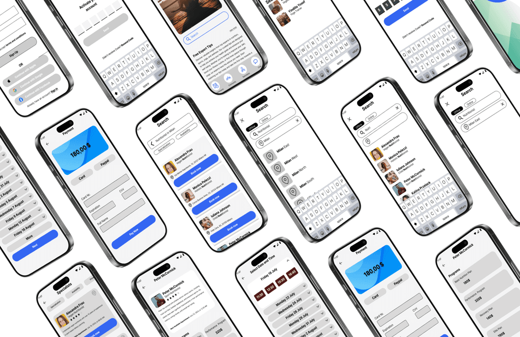
HolisticHub is a responsive web application designed to simplify access to holistic wellness services.
Project
For my project, I embarked on a mission to develop a platform that connects users with certified holistic health experts, helping them achieve their wellness goals more efficiently and effectively. In this case study, I will provide an overview of the design process for HolisticHub. I will also discuss the challenges I faced and how I overcame them to deliver a functional and intuitive platform that meets users' needs.
Problem
Over 74% of people find it difficult to navigate the abundance of wellness information available online, leading to confusion and inaction. Approximately 55% are skeptical about the credibility of online wellness advice, making it hard to find reliable, certified professionals. Busy schedules leave 60% of individuals with little time to research and connect with wellness experts. These challenges often result in neglected health goals and a sense of frustration.
Solution
Drawing on my sports background and entrepreneurial experience, I developed a web application that connects users with certified professionals offering personalized support. This ensures that users receive expert advice tailored to their unique goals, bridging the gap between individuals seeking guidance and the professionals who can provide it.
Meine Rolle
Forschung
Drahtgittermodellierung
Prototypisierung
Benutzerfluss
Benutzertests
UI/UX-Designer
Zeitrahmen ( Wochen )
Entdeckung und Forschung (1-3)
Ideation (4-6)
Design und Prototyping (7-9)
Tests und Iteration (10-12)
Projekt
Karriere Foundry
Fallstudie
Endgültige UI-Bildschirme: 30+
Interviews: 15+ Personen
The big “why”, goals that shaped my exploration
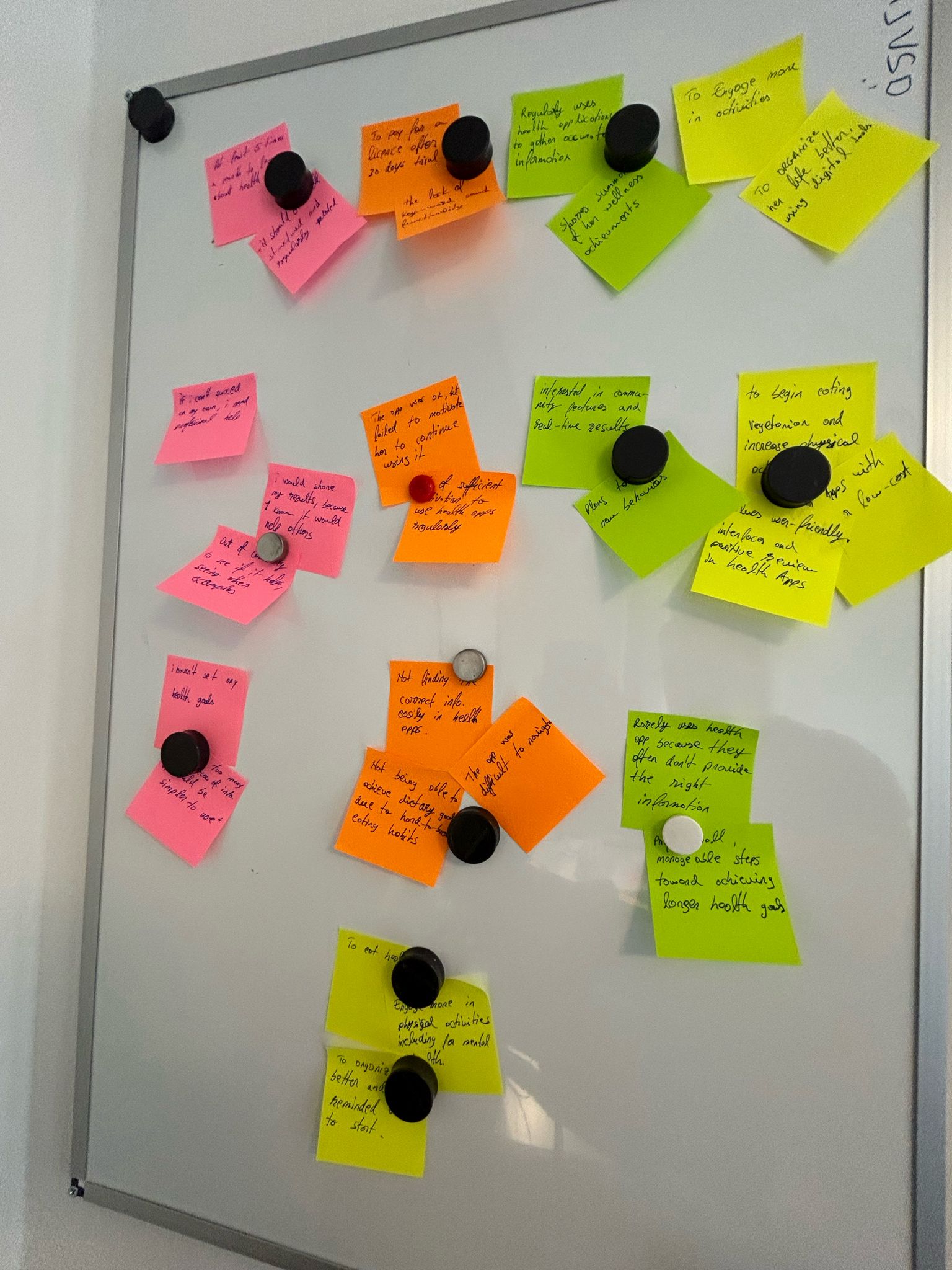
Conducted interviews with 5 participants aged 25-45 who are interested in wellness but find it challenging to access reliable resources.
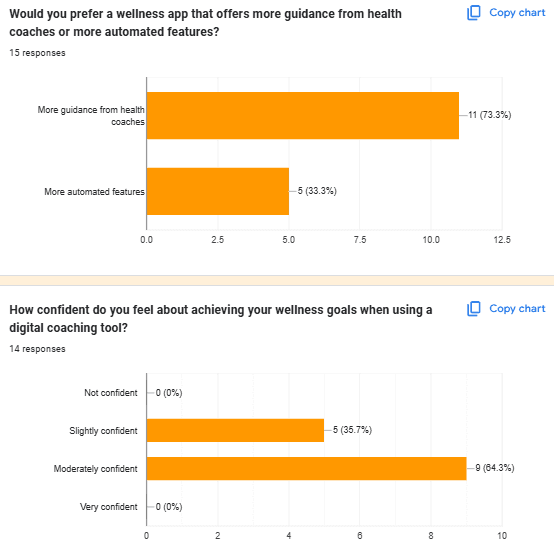
Quantitative data
Some participants took part in 15-minute semi-structured interviews focusing on their experiences with accessing wellness services, while others completed a Google form.
Doctolib offers online booking with healthcare professionals but focuses mainly on traditional medicine.
In my analysis of Doctolib and Jameda, I found that both platforms enhance healthcare by allowing users to send medical receipts and direct messages to providers, improving communication and convenience. Their mobile support enables remote patient-provider interaction, increasing accessibility. However, the limited language options restrict access for non-native speakers. By focusing mainly on traditional medical practitioners, they also miss the opportunity to include other wellness professionals for a more holistic care approach.
Jameda is Germany's largest doctor-patient platform, providing appointment bookings and doctor reviews.
Opportunities for growth include adding translation features to attract international users, expanding operational areas to increase market share, and introducing an affiliate system for new revenue streams. Threats involve the rise of similar platforms leading to user base fragmentation and new data security laws imposing stricter requirements, potentially increasing operational costs.
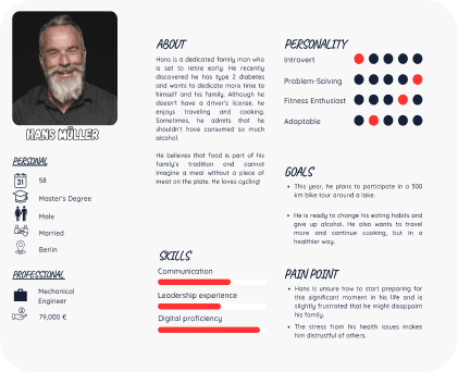
Bringing users to life, personas that made it personal
Creating personas, I aimed to capture diverse user perspectives. This approach allowed me to focus on key user needs and behaviors while ensuring that the design remained inclusive.
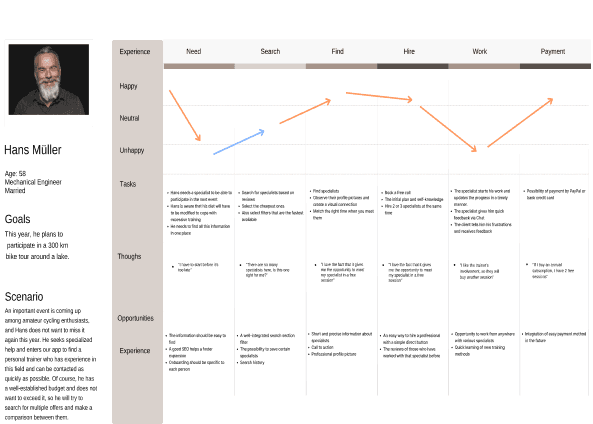
Walking through the user's path to enhance every interaction
By thoroughly mapping out the user journey and embracing the challenges along the way, I was able to create a more intuitive and compassionate platform that truly meets users' needs.
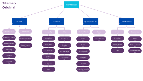
Designing a seamless structure for intuitive navigation
To establish a clear and intuitive platform structure for HolisticHub, I began by designing an initial sitemap based on the insights gathered from preliminary research and my understanding of user needs. The goal was to ensure that users could easily navigate the platform and access key features without confusion.
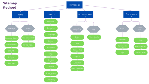
Optimizing the Sitemap with card sorting
To validate and refine the sitemap, I used Optimal Workshop for an online card sorting session with 20 cards. This gave me direct insight into how users naturally organize information, which led to valuable adjustments in the site's structure.
Transforming my design based on real user experiences
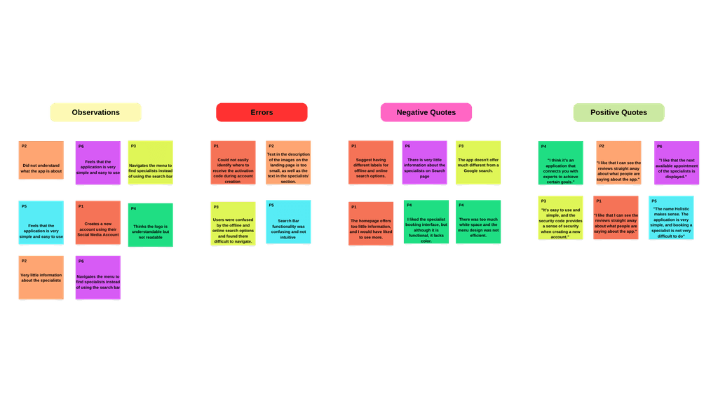
During the usability testing process, I discovered valuable insights that will significantly shape the final product. While over 80% of participants found the app fast and easy to use, certain areas still need improvement to enhance efficiency.
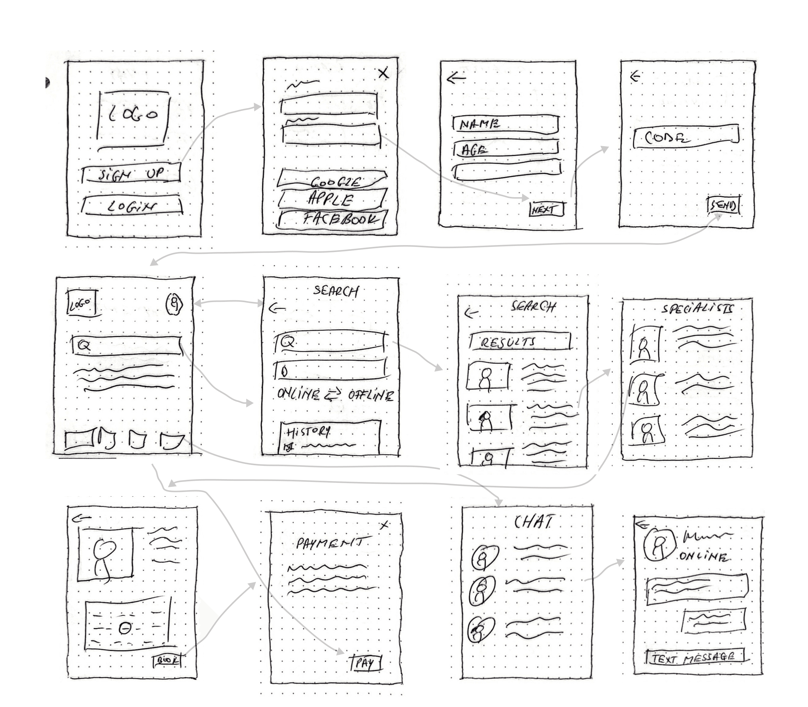
I began by sketching initial ideas on paper, which quickly evolved into wireframes. These wireframes laid the foundation for the mid and high-fidelity designs that followed.
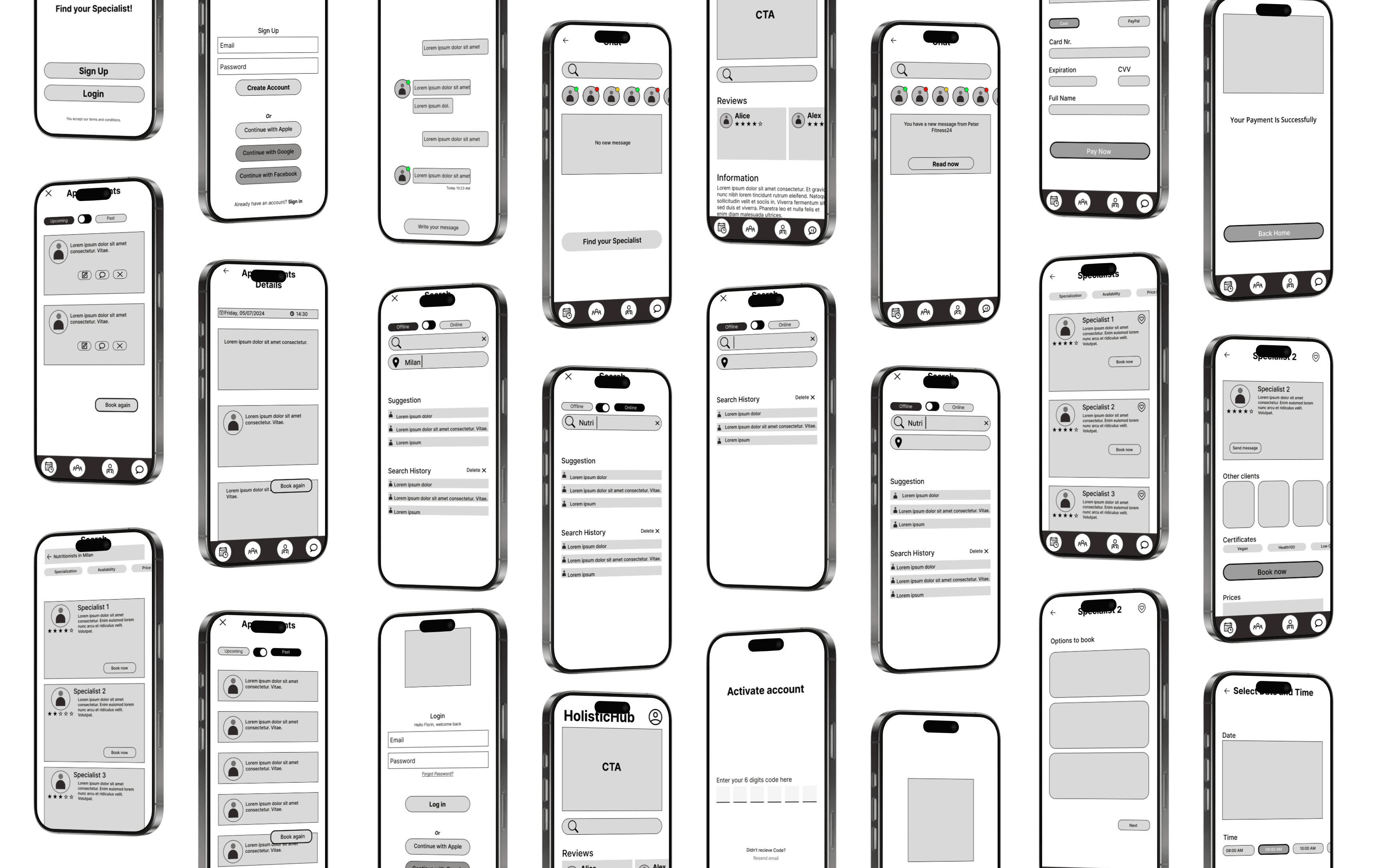
Wireframes
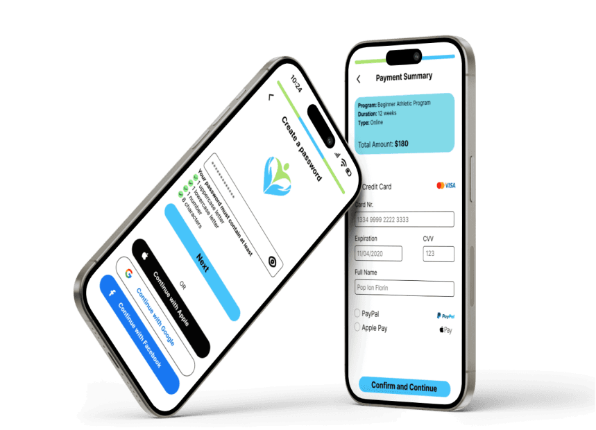
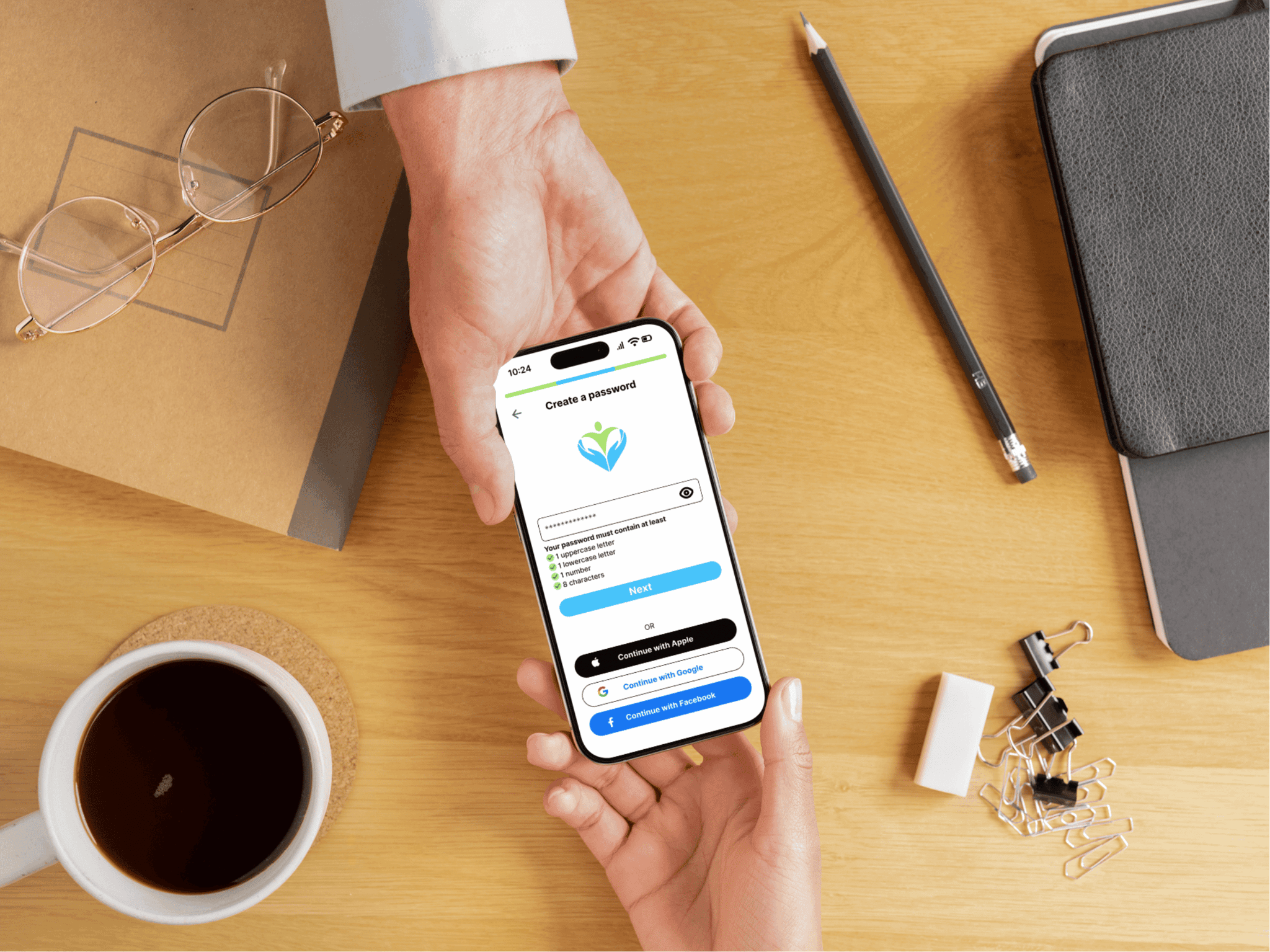
I conducted another round of feedback sessions with potential users, providing them with clickable prototypes of the mid-fidelity wireframes. This allowed me to observe how they interacted with the design and identify any points of confusion or friction.
Testing and final design
What truly set this project apart was my ability to uncover the deeper motivations behind users’ thinking. By asking the right questions and probing beyond surface-level responses, I transformed their insights into actionable design solutions that address real user needs. The final prototype not only aligns with the project's goals but also provides a solid foundation for development and future enhancements.
Challenges
The primary challenge was the temptation to include too many features, which risked overwhelming users and diluting the platform's core purpose. I realized that an overload of options could lead to user confusion, decreased usability, and ultimately, disengagement.To address this, I refocused on the insights gathered from user research. By revisiting the data and empathizing with users, it became clear that simplicity and ease of use were paramount. Users expressed a need for a straightforward way to connect with certified professionals without unnecessary distractions.
Lessons Learned
Through these challenges, I learned the true power of simplicity. By focusing on the essential features, I saw how much it improved the user experience. I realized that empathy plays a crucial role in understanding users’ deeper needs, allowing me to create more meaningful designs. Keeping users at the heart of the process helped me deliver solutions that truly addressed their needs. I also learned to be flexible, adapting to new insights along the way, which ultimately strengthened the final product.This journey reinforced my belief that successful design is not just about aesthetics or feature sets but about creating real value by addressing the true needs of users. It highlighted the importance of continual learning, empathy, and the willingness to refine and adapt—a philosophy I carry forward into all my future projects.

